

There is a moment most homeowners recognise. You have repainted the front wall, tidied the garden, replaced the light fitting by the door, and yet something still feels off. The house looks better, but not quite right. Not quite finished. It is a frustrating place to be, and the cause is not always obvious until someone points it out.
In a surprising number of cases, the culprit is the windows and doors.
Not their condition, necessarily. Not even their style. Just their colour. Or rather, the absence of one.
When Neutral Stops Being Neutral
White uPVC was sold to homeowners for decades on the basis that it was a safe, neutral choice. And in the context of its time, that was broadly true. When everyone on the street had white frames, white frames were unremarkable. They disappeared into the background, which was more or less the point.
The problem is that design expectations have moved on considerably. Homeowners today are far more attuned to the exterior appearance of their properties, and what once read as neutral now reads as dated. White uPVC that has begun to yellow or discolour makes the problem worse, but even clean, well-maintained white frames can make a property look generic in a way that holds it back.
The solution does not have to be dramatic. A professional colour coating applied to existing uPVC frames can modernise the look of a property significantly, often for a fraction of the cost and disruption of replacing the windows and doors entirely. For homeowners who want a meaningful exterior update without committing to a full renovation, it is one of the most practical options available.
What Your Windows And Doors Communicate
It sounds like an overstatement to say that window frames communicate something about a property, but it is not really. Exterior details send signals. A well-chosen door colour says the owners have thought about how the house presents itself. Consistent, considered frames suggest care and attention. The overall impression of a home that has been deliberately put together, rather than simply inherited and left as found, is one that registers with visitors and passers-by alike.
This matters most when a property is on the market, but it matters at all other times too. Most people spend years in their homes, and there is genuine value in living somewhere that feels cohesive and considered rather than accidental.
Matching Colour To Property Type
The right colour choice varies considerably depending on the age, style, and setting of a property, and it is worth taking the time to think it through rather than following a trend blindly.
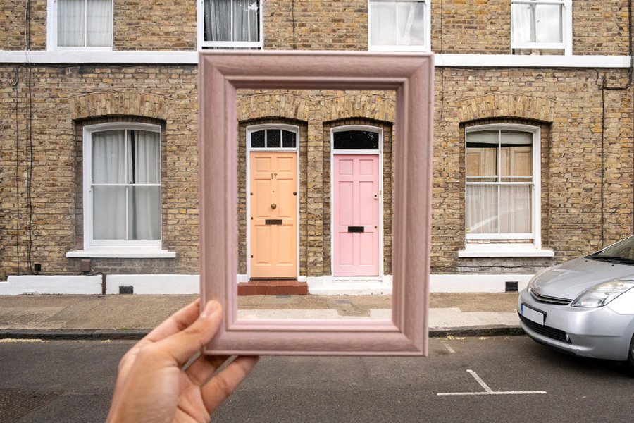
Period properties respond well to heritage tones. Sage and olive greens have become extremely popular on Victorian and Edwardian homes, particularly terraces, and they work because they feel rooted in a colour palette that has always suited British brickwork. Slate grey and dark charcoal are strong choices for properties with stone or render facades. Cream and warm off-white shades suit cottages and older rural homes, giving a sense of warmth without the harshness of bright white.
Contemporary new builds offer more freedom. Anthracite grey remains the dominant choice for a reason — it is clean, architectural, and pairs well with the composite doors and minimal detailing typical of modern construction. Black works on bolder schemes. Navy and deep teal are less common but can look exceptional on the right property with the right supporting details.
If you are unsure, look at neighbouring properties and note what works. Look at architectural photography of homes with a similar footprint and build period. Colour choices that feel coherent with a property’s character almost always outperform those that fight against it.
The Question Of Hardware And Surrounding Detail
Colour does not exist in isolation. The hardware on your doors and windows — handles, hinges, knockers, letterboxes — contributes to the finished effect, and a mismatch between frame colour and hardware finish can undermine an otherwise strong scheme.
Brushed chrome and satin nickel tend to work well with cooler greys and slate tones. Brass and bronze suit warmer greens, creams, and heritage colours. Matte black hardware is versatile and has become increasingly popular across a wide range of frame colours.
The same thinking applies to your guttering, fascias, and soffits. These are not afterthoughts. On many properties they are highly visible, and keeping them in a consistent or complementary tone to your frames will do far more for the overall result than most people expect.
Durability And Realistic Expectations
A question worth asking before committing to any colour change is how long the result will last and what it will look like in three, five, or ten years.
A professionally applied coating using materials designed for exterior uPVC should perform well for many years. Surface preparation is critical — poorly prepared frames will not hold a coating properly regardless of the quality of the product applied. Reputable specialists will clean, degrease, and abrade the surface before coating, and will apply multiple layers to ensure even coverage and durability.
Maintenance requirements are modest. Periodic cleaning with a non-abrasive detergent will keep the finish looking fresh. Avoid anything that might scratch or chemically affect the surface, and deal with any chips or damage promptly before moisture gets beneath the coating.
As with most things in home improvement, the difference between a result you will still be pleased with in a decade and one you will regret within a couple of years comes down largely to the quality of the work and the people doing it.
A Change That Earns Its Keep
Exterior improvements vary enormously in how much they return relative to what they cost in time, money, and disruption. Changing the colour of your windows and doors sits near the top of that list for most properties. It is visible, immediate, and often transformative in a way that is difficult to achieve through other means at a comparable cost.
If your home has been nagging at you and you cannot quite identify why, it might be time to look at the frames.